Website design isn’t something you hop on without planning any strategy in advance. Did you know the site you browse easily would have gone through a lot of thought process?
Be it for your in-house web project or about targeting the customers, sketching an outline gives you a road-map to go ahead. Even, every website developer should practice this strategy before starting a project. But here comes the question— how?
Here we are going to discuss the anatomy of a website and tips to create an outline template.
1. Go to the root of purpose
Do you know what you’re designing for? You can’t go on a path that doesn’t lead to your destination, can you? Therefore besides having a description of the website, you have to know the expectations it has.
For example, let’s talk about a new site. What’s its goal? Is it for marketing purpose or to provide the best shopping experience? How are you going to measure those goals?
A good website isn’t the one that has the flashiest features, but the one with the improved performances over the period. And, to define all of these, talk to your clients or superiors before kicking off the design task.
2. Balance your business requirements with user requirements
Clients do have a wish list for their new website. And, you have to get that wish list which contains their business requirements.
Create a list of business needs by putting into it “must have features to do X task.” Ask the client to rate these “must have abilities” tasks starting from the most important to least. This will help you and your client to define priorities.
Remember, not all features mentioned in the business requirements are going to make into the initial state of the website. Not only time and money, but users requirements also influence the feature list whether certain features have to be added or cut off.
After brainstorming various scenarios, and user needs that the site must have, go through the list again and rate each feature on your own.
The feature should accommodate the user’s priorities. Also, list those features that you think users would like to see.
3. Categorize and Prioritize information for your site’s outline
After you have gathered the information, it’s time to translate the user requirements and business requirements into an old-school outline. This outline will help you create a sitemap.
One of the easiest ways to build a successful outline is to group similar features and items. Getting familiar with the list of features and contents will form a pattern. In the meanwhile, you will find out that some items go together while some don’t fit the list at all.
Below are some steps that show how to convert your prioritized list of requirements into an effective outline.
Create a group:
● Find out the features and content that are identical. Now, put them together.
● Consider every entry within a certain group as one page of features or content.
Make sure to limit the groups to 5 to 7 entries only:
For enhanced usability, categorize five to seven main groups and not more than that. If it sounds challenging as it’s for a large site, categorize up to 3 groups.
Prioritize them as primary, secondary as well as tertiary groups.
Keep the depth of every group to two levels:
You will get a list of items under every group. However, in some instances, there will be a subcategory for a particular item. Do not go beyond the one additional level while creating a subcategory.
This is helpful from the usability point of view.
If you create more subcategories and make the group deep, it will create navigational challenges in website design.
Consider the example given below. Pay attention to the numbering level.
1. Company’s About Us
1.1 Contact Us
1.2 Partners
1.2.1 Home furniture partners
1.2.2 Kitchen appliances partners
1.3 Press/Media
1.4 Company History
1.5 Members
Create a group based on global features
In case the list of requirements has details like a search feature or login tools, or essential pages such as terms of use or privacy policy, keep them into a universal or global group.
Links of these tools and pages can find a strategic place either in the header section or footer section of your site.
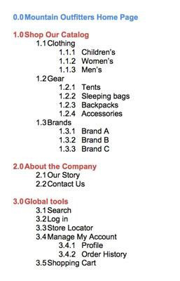
Here is an example to understand it better:

Set up navigation points priority-wise
The primary purpose of creating groups and categorizing information is to streamline the navigational system of the whole website. Remember, the groups and categories you create are going to appear on every page of your site.
Since a user can have many choices, the best way is to group these navigation sets. Also, provide the users with visual treatments to so that they become interested in your page.
In the case of just one set of groups, it becomes your primary navigation. This makes design easy and simple.
However, if there are multiple sets of groups, you have to decide which one is going to be the primary navigation.
The rest will fall into the secondary and tertiary sets of navigation. Each of secondary and tertiary sets will have a lesser or different visual treatment.
They will also have a different location on the site. Do not have more than seven groups within the primary, secondary and tertiary sections or else usability will be decreased. Providing customers with more than seven choices creates difficulties for them.
However, it is a good practice to put all the key navigation elements together provide them with the same visual treatment. It allows users to effortlessly distinguish each navigation-set as well as their importance.


